SkyPhi Studios
Bringing beauty and boldness to change management.
Client:
SkyPhi Studios
Date:
2025
My Role:
Freelance Web Design
Overview:
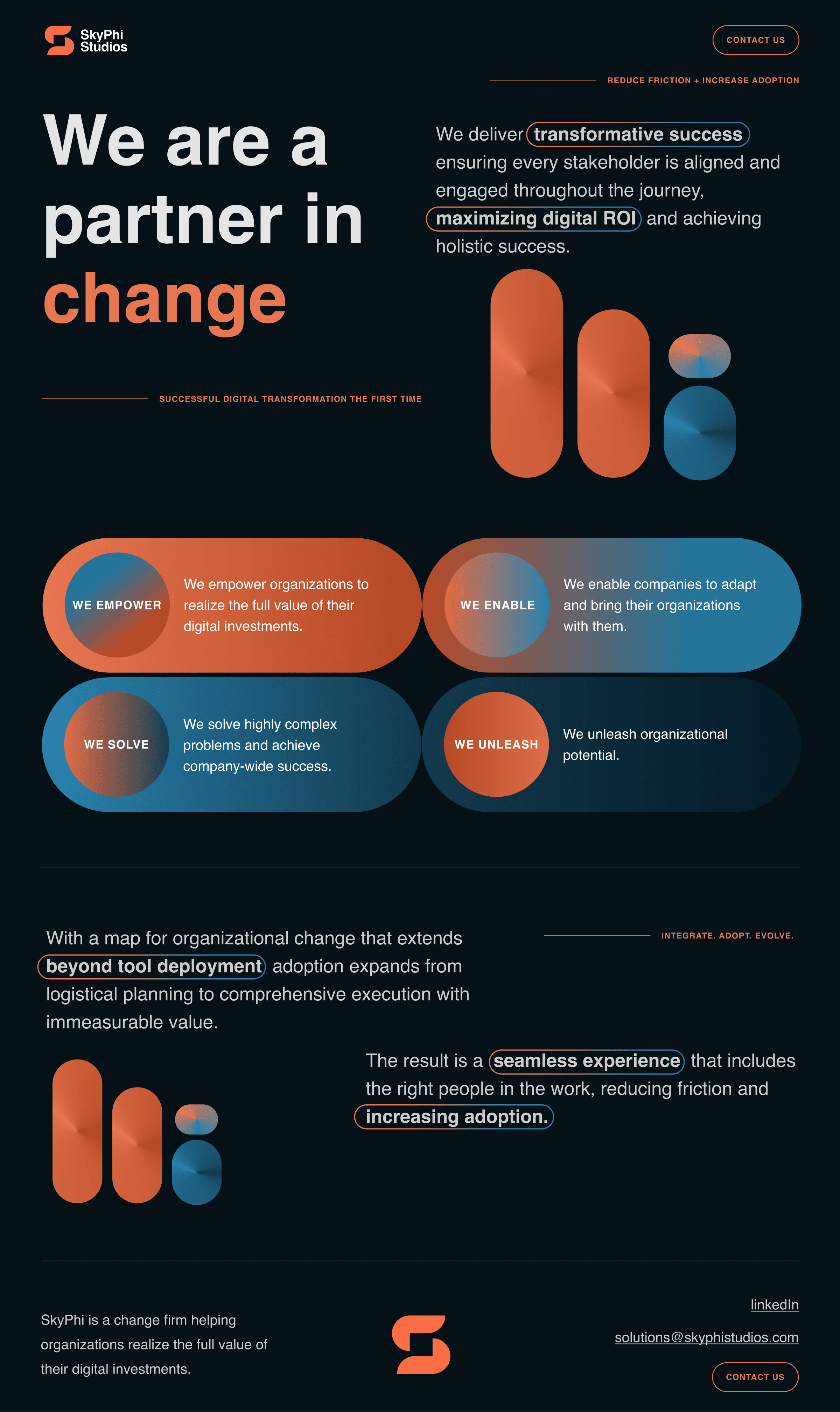
SkyPhi Studios is a change management consultancy helping organizations navigate operational transformation. In 2025 I led the redesign of their marketing website as a freelance engagement — a project with a distinctive creative brief: build something modern and experimental, where geometric shapes serve as the primary vehicle for visual meaning.
This project sits in my portfolio because it demonstrates a different kind of design thinking than the Rev work. Where Rev required data-driven decision making and conversion optimization at scale, SkyPhi required concept-driven creative direction — starting from an abstract visual idea and building a coherent, compelling design system around it.
Note: The live site is temporarily offline. The preview link to the left reflects the final published design and is the best way to experience the full site beyond what’s shown in the case study.
The Challenge:
SkyPhi came to the redesign with four distinct problems to solve.
First, the existing site didn’t clearly communicate what SkyPhi does or the value it delivers. Change management is a nuanced service that organizations often struggle to articulate — and the old site wasn’t helping.
Second, the client had a specific and unconventional creative direction: shapes as the primary vehicle for visual meaning. Not as decoration, but as a core design element that carried communication weight throughout the experience.
Third, the site was outdated and lacked a user-centered approach. As part of the redesign, I partnered with a developer to migrate SkyPhi to Wix for greater platform flexibility, and worked alongside them to implement SEO best practices across every page — meta titles, meta descriptions, and proper heading tag hierarchy — to give the new site a stronger foundation for organic discovery.
Fourth, SkyPhi had established branding that needed to be preserved. The goal was elevation, not replacement — bringing the visual design forward without abandoning the identity they’d built.
The original site illustrates all of these challenges clearly. You can see it here: skyphistudios.com. The dated design, unclear messaging, and lack of visual concept are immediately apparent — and informed every decision made in the redesign.
The Approach:
Research Into Experimental Design
While the client provided strong starting inspiration, I wanted to push further — specifically around experimental layout and unconventional uses of geometric shapes. The goal wasn’t just to find visual references, but to understand how shapes could carry meaning rather than just aesthetic interest. What does a shape communicate? How does it direct attention? How does it create rhythm and hierarchy without relying on photography or illustration?
The FigJam below captures that exploration — the references, the ideas, and the thinking that shaped the final direction.
Shapes as a Design System
The shape-driven direction required treating geometry as a functional design element, not a decorative one. Every shape decision — scale, placement, color, overlap — was made with communication in mind. Shapes created visual hierarchy, guided the eye through the page, and gave the site a distinctive, memorable identity that stood apart from the conservative visual language common in the consulting space.
For a change management firm, that distinctiveness was itself a strategic signal. SkyPhi helps organizations do things differently. The design needed to feel like proof of that.
Clarity in a Complex Space
Change management is a category where prospects often struggle to understand exactly what they’re buying. The redesign prioritized clear, direct communication of SkyPhi’s value — what they do, who they help, and what working with them looks like — structured to reduce confusion and build confidence quickly.
Platform Migration and SEO Foundation
Moving to Wix gave SkyPhi’s team the ability to manage and update the site independently for the first time. I partnered with a developer to execute the migration and implement SEO best practices across every page — meta titles, meta descriptions, and proper heading tag hierarchy — ensuring the new site was built to be found, not just seen.
The Result:
A bold, concept-driven website that gave SkyPhi a visual identity as distinctive as the work they do — built on a modern platform with a strong SEO foundation, and designed to communicate their value clearly to organizations considering change management services.


Related Projects

